Correlation Matrix
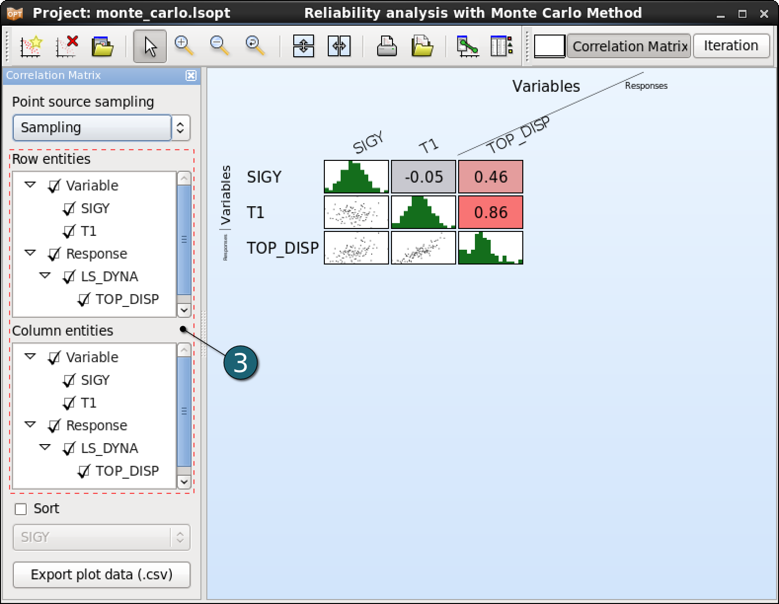
The correlation matrix displays 2D scatter plots, histograms and the linear correlation coefficients calculated from the simulation results.
Home Screen Process Flowchart
- Click on the Open the viewer icon in the contral bar on the Home Screen Process Flowchart window.
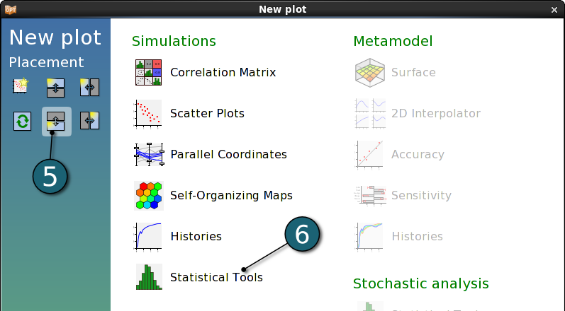
A New Plot window shall open.
- Choose Correlation Matrix under Simulations.


Correlation Matrix Settings
- Select variables SIGY and T1 and response TOP_DISP for both Row and Column entities.
- The correlation coefficients are color-coded from blue to red. Blue indicates a strong negative correlation, red a strong positive correlation, whereas grey indicates almost no correlation.
- Moving the mouse on a scatter plot displays its ranges and marks the respective correlation coefficient with a yellow border, and vice versa.

Correlation Bars
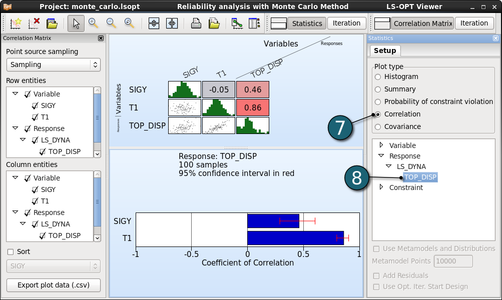
The coefficients of correlation of the responses and composites with respect to design variables can be displayed, along with their confidence intervals.
- Click on the New Plot button in the menu bar - (or click on the Open the viewer button on the Home Screen Process Flowchart as done for the first result plot).
- Select Split vertical option on the left side to have this plot together with the correlation matrix.
- Select Statictical Tools under Simulations.
- Select Correlation as a Plot type in the Setup of new opened second plot (right side of the LS-OPT Viewer).
- Select the response TOP_DISP to display its coefficient of correlation. The same values that are displayed in the last column of the correlation matrix, with additional information on the 95% confidence intervals.


